Das Besondere der ModEurop ColourCard: Die Farben der übernächsten Saison in ihrer Materialwirkung. Ausgewählt von einem Experten-Team. Praktisch im A5-Format, mit Farbmustern in Echtleder und anderen Materialien, mit A3 Farbposter und verbindlichen Pantone-Angaben. Aufgeteilt auf drei Stimmungsfelder bietet die ModEurop ColourCard hilfreiche Orientierung für Designbüros und Hersteller.
The ModEurop ColourCard is unique, showing the colours from the season after next in real materials – chosen by our expert team, in practical A5 format, with colour samples in real leather and other materials, an A3 colour poster and reliable Pantone codes. Divided into three different moods, the ModEurop ColourCard offers design studios and manufacturers helpful orientation.
Order current ColourCardColourCard
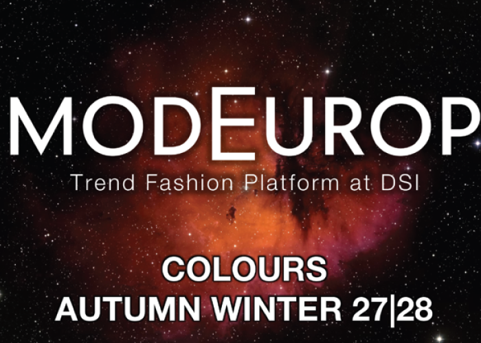
AW 27/28
Out: May 2026
Dieses Farbszenario lädt zu einem Spaziergang durch einen winterlichen Rosengarten im Schlosspark ein.
Die letzten Blüten erstarrt unter perlig schimmerndem Raureif. Dazu ein mit buntem Herbstlaub bedeckter Kiesweg. Zart-romantisches MAUVE verbindet sich mit der dunklen Eleganz von WINDSOR WINE und der Tiefe von GREEN JASPER zu einem noblen Trio und setzt den Grundstein der Thematik. Dazu BLACK AMETHYST als Sparringspartner und edlem Begleiter. GOLDEN GLOW zaubert goldenes Herbstlicht auf die stimmungsvolle
Szenerie und CARTHUSIAN GREY lässt leichten Bodennebel aufsteigen. Der weiche Sandton von SANDSTONE versinnbildlicht die umgebenden Mäuerchen, und steht in perfekter Harmonie mit dem fast schwarzen Erdton von EBONY. Auf einem Tischchen eine zarte Porzellanschale gefüllt mit köstlichem KOMBU – auf einen mysteriösen Gast wartend. Ein tagträumerisches Winterszenario mit geheimnisvoller Aura. Raffinierte Farbakzente in Kombination mit dunklen, eleganten Farbtönen ermöglichen eine neue Klassik mit innovativem Charakter.
This color scheme invites you to take a stroll through a winter rose garden in the castle grounds. The last blooms are frozen in place beneath a pearly, shimmering frost. A gravel path covered in colorful autumn leaves completes the scene. Delicate, romantic MAUVE combines with the dark elegance of WINDSOR WINE and the depth of GREEN JASPER to form a sophisticated trio, laying the foundation for the theme. BLACK AMETHYST serves as a sparring partner and elegant companion. GOLDEN GLOW casts golden autumn light onto the atmospheric scene, while CARTHUSIAN GREY conjures up a light mist rising from the ground. The soft sandy hue of SANDSTONE symbolizes the surrounding low walls and stands in perfect harmony with the almost black earth tone of EBONY. On a small table, a delicate porcelain bowl filled with delicious KOMBU—waiting for a mysterious guest. A dreamy winter scene with a mysterious aura. Sophisticated color accents combined with dark, elegant shades create a new classic with an innovative character.
Colour Trends
AW 27/28
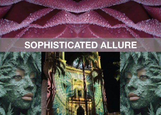
SOPHISTICATED ALLURE
Was geschieht, wenn die KI mit barocken Kunstwerken, Comics und 80er-Jahre Ikonen gebrieft wird, um etwas Neues daraus zu generieren? Dieses Farbszenario entstand nicht auf diese Weise. Doch muten die zu diesem Thema gesichteten Kollektionen ein wenig so an, als wäre an dieser Hypothese etwas dran. Energetisch strahlendes CALCITE YELLOW wird durch die warme Energie von TEMPTATION zusätzlich aufgeladen. Dunkles, leicht angetöntes PORTWINE wagt den Schulterschluss. Dazu liefert AMBERWOOD ein nostalgisches Kontrastprogramm, welches von BEAR unterstützt wird. SHEARLING versprüht in diesem Zusammenhang ein wohlig winterliches Flair. Moderne Kühle bringt VINTAGE BRASS ins Spiel, welches durch DARK DOVE harmonisch kontrastiert wird. Tiefgründiges BAROQUE BLUE verbindet diese Komponenten zu einem lebendigen Winterszenario, das sowohl tonale Kombinationen als auch kraftvolle Kontraste ermöglicht und eine moderne Ästhetik generiert.
What happens when AI is fed baroque artworks, comics, and 1980s icons to generate something new? This colour scheme did not come about in that way. Yet the collections we’ve seen on this theme give the impression that there might be some truth to this hypothesis. Energetically radiant CALCITE YELLOW is further energized by the warm energy of TEMPTATION. Dark, subtly tinted PORTWINE dares to join forces. AMBERWOOD provides a nostalgic counterpoint, supported by BEAR. In this context, SHEARLING exudes a cozy wintery flair. VINTAGE BRASS brings a modern coolness to the mix, harmoniously contrasted by DARK DOVE. Profound BAROQUE BLUE unites these elements into a vibrant winter scene that allows for both tonal combinations and bold contrasts, generating a modern aesthetic.
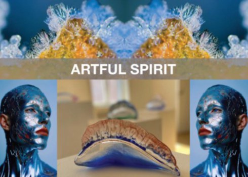
ARTFUL SPIRIT
Romantasy – magische Welten, Abenteuer und Mythen. Eskapismus als Befreiung vom Alltag und der Realität. Diese märchenhafte Szenerie verbindet Opulenz mit modernem Twist. Das Farbszenario dazu startet harmonisch kühl mit sanftem ICE HOLE, welches durch die mystische Tiefe von PETROL begleitet wird. GREY FLANNEL bindet die Realität mit ein, wird zugleich von ROSE SALT in zartere Sphären gelenkt. Die exquisite Kühle von PLATINUM wird durch die feudale Strahlkraft vom GEMSTONE elegant unterstützt. ROYAL LILAC sorgt für zusätzliche Raffinesse, die in VENETIAN BROWN einen modernen Sparringspartner findet. NUTRIA erdet das Szenario und sorgt für einen modernen Realismus. Alles in allem ein üppiges, kraftvolles Winterszenario mit optimistischer Strahlkraft.
Romantasy—magical worlds, adventures, and myths. Escapism as a liberation from everyday life and reality. This fairy-tale setting combines opulence with a modern twist. The color palette begins with a harmonious coolness, featuring the soft ICE HOLE, accompanied by the mystical depth of PETROL. GREY FLANNEL anchors the look in reality while being guided into more delicate realms by ROSE SALT. The exquisite coolness of PLATINUM is elegantly complemented by the regal radiance of GEMSTONE. ROYAL LILAC adds an extra touch of sophistication, finding a modern counterpart in VENETIAN BROWN. NUTRIA grounds the scene and lends a modern realism. All in all, a lush, powerful winter scene with an optimistic radiance.